Getting started with MQFramework is very simple and there are only a handful number of steps for you to follow. Read on to learn more.
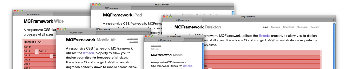
With the rise of mobile devices, it is expected that your website will function and be viewable on the smaller screen sizes. With MQFramework you can build a site that reacts upon screen size. From widescreen monitors to small mobile devices. Just resize this page to watch it transform.
MQFramework is structured to suit different needs, be it from a new project to fitting into an existing project with very little changes to the code. One CSS file imports the framework files and a custom stylesheet for the design of your site.
Download the latest build of your choice, then extract the files and directories into your project folder. MQFramework has an understandable directory for you to quickly get going.
Extract the contents of the download into your project directory. There you will find a folder for your CSS, Images and scripts of your choice. Also included are humans.txt and robots.txt files for you to edit and modify for your project.
Within MQFramework, your custom styling files are called from a global CSS file (master.css). All found within the CSS folder. It is recommend that you do not edit the file “/css/base.css” as this is the main framework styling.
|
1
2
3
4
5
6
7
8
9
10
11
12
13
|
@media only screen and (min-width: 960px) and (max-width: 1139px) {
}
@media only screen and (min-width: 768px) and (max-width: 959px) {
}
@media only screen and (min-width: 480px) and (max-width: 767px) {
}
@media only screen and (min-width: 320px) and (max-width: 479px) {
}
@media print{}
|
|
1
2
3
4
5
6
7
8
9
10
11
12
13
14
15
16
|
|
© 2011 · HTML5 · CSS3