Download the Fixed Version or Fluid Version
Grid 12
Grid 1
Grid 11
Grid 2
Grid 10
Grid 3
Grid 9
Grid 4
Grid 8
Grid 5
Grid 7
Grid 6
Grid 6
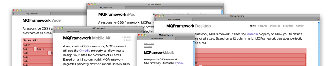
MQFramework is designed for five different screen resolutions. But with that comes the challenge of displaying the information you require.
MQFramework is built and designed around a 12 column grid. For each of the supported screen sizes MQFramework has adopted a different width of container to house the grid. As for mobile versions, the twelve columns become one stacking up vertically.
Grid 3 with a "push_1"
Grid 3 with a "push_2"
Grid 3 with a "push_3"
Grid 3 with a "push_4"
Grid 3 with a "push_5"
Grid 3 with a "push_6"
Getting to grips with MQFramework is easy, if you understand how a grid system works.
MQFramework is very easy to customize. We have included a seperate stylesheet for your styles and settings. This stylesheet should be the only one you should have to modify at great detail to get your design working.
Included is a basic typography stylesheet for your needs, but don't fret, you can use your favourite @font-face fonts and change all the styles to suit your project.
Grid 3 with a "prefix_1" class
Grid 3 with a "prefix_2" class
Grid 3 with a "prefix_3" class
Grid 3 with a "prefix_4" class
Grid 3 with a "prefix_5" class
Grid 3 with a "prefix_6" class
© 2011 · HTML5 · CSS3
[email protected]