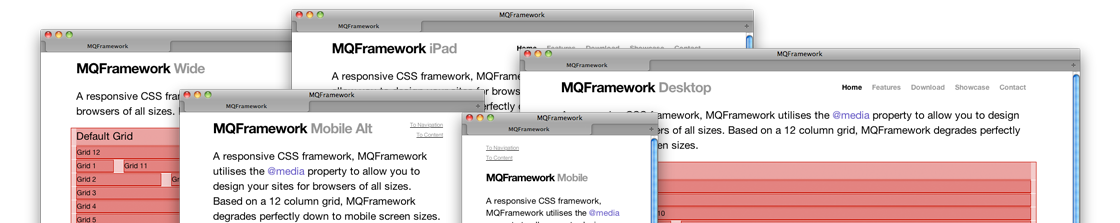
A responsive CSS framework, MQFramework utilises the @media property to allow you to design your sites for browsers of all sizes. Based on a 12 column grid, MQFramework degrades perfectly down to mobile screen sizes.

Fluid Version

Grid 12

Grid 1

Grid 11

Grid 2

Grid 10

Grid 3

Grid 9

Grid 4

Grid 8

Grid 5

Grid 7

Grid 6

Grid 6

© 2011 · HTML5 · CSS3