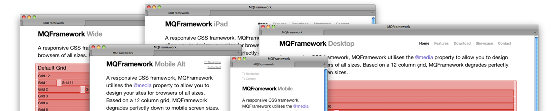
A responsive CSS framework, MQFramework utilises the @media property to allow you to design your sites for browsers of all sizes. Based on a 12 column grid, MQFramework degrades perfectly down to mobile screen sizes.
The page you're looking for is not found, please go to the previous page.